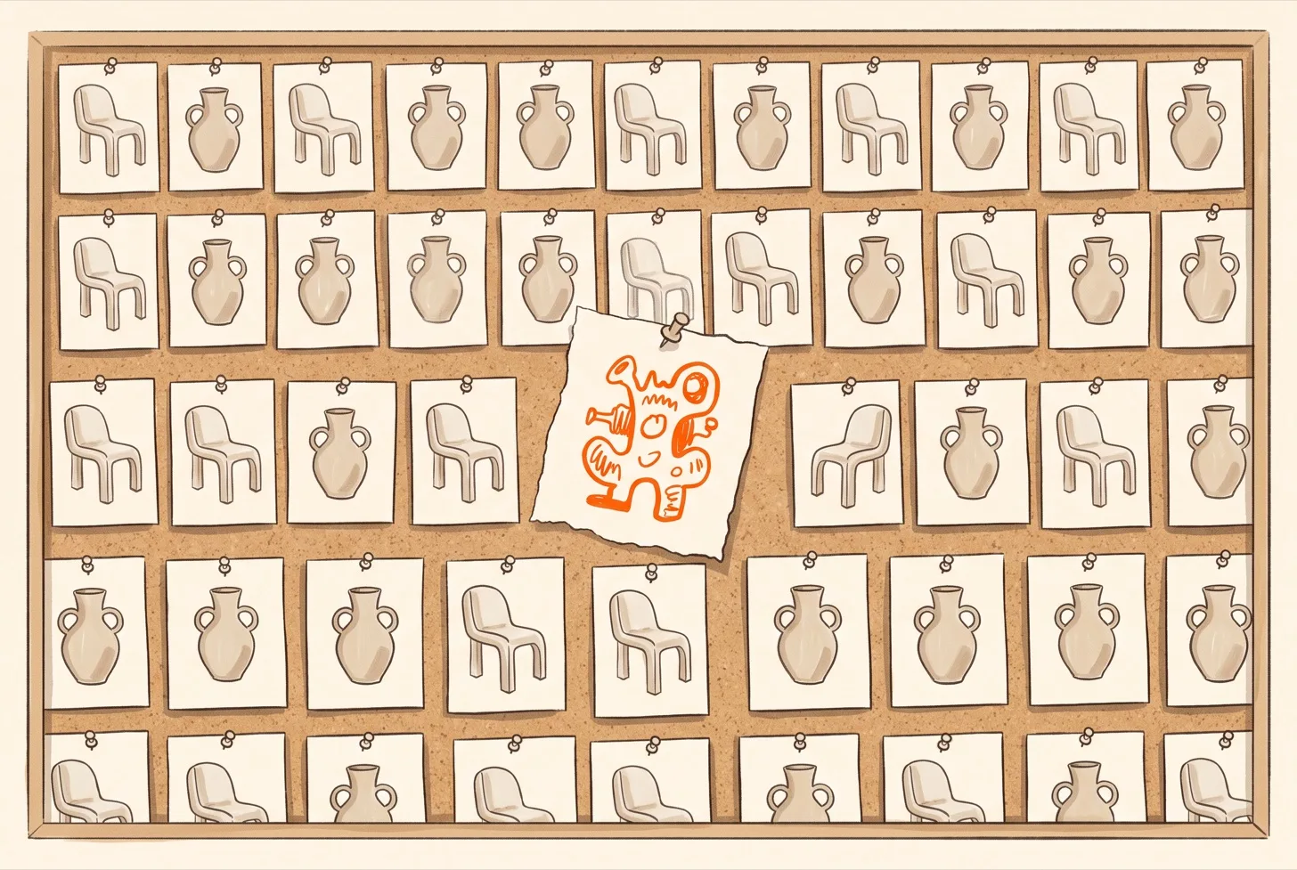
Open any mood board.
You know the one. Soft beige tones. A ceramic vase that costs more than your rent. A chair with exactly one dramatic curve. A poster in a thin black frame. A serif typeface looking quietly expensive.
Now open a different mood board. For a different project. Made by a different person in a different city.
Spot the difference.
I’ll wait.
A while ago I wrote about the website test. Cover the logos on ten sites and see if you can tell them apart. That piece was about templates and tools and the pull of the average. This one is about something earlier in the process. Something that happens before anyone opens a design tool at all.
It is about where we look for ideas. And what happens when everyone looks in the same place.
01/ 06
The greatest library in history
Let’s give the present its due. We have access to more creative reference than any generation before us. A designer in a small town can browse the work of a thousand studios before breakfast. A student can study the posters of a decade in an afternoon. Nobody has ever been this well fed.
And yet.
When you put all that inspiration through the same few pipes you get a strange result. The pipes have preferences. They push up what gets saved and shared and liked. Things that photograph well and read quickly and look good small. Over time the whole ecosystem leans in one direction.
Walk through the cafe lanes of Bandra or Indiranagar or Hauz Khas and you will notice a pattern. Pastel walls. A neon sign with a cheerful phrase. A monstera in the corner. Light wood and exposed bulbs and a menu in a thin sans serif. Lovely every single time. Also nearly interchangeable. You can land in a new city and feel like you never left.
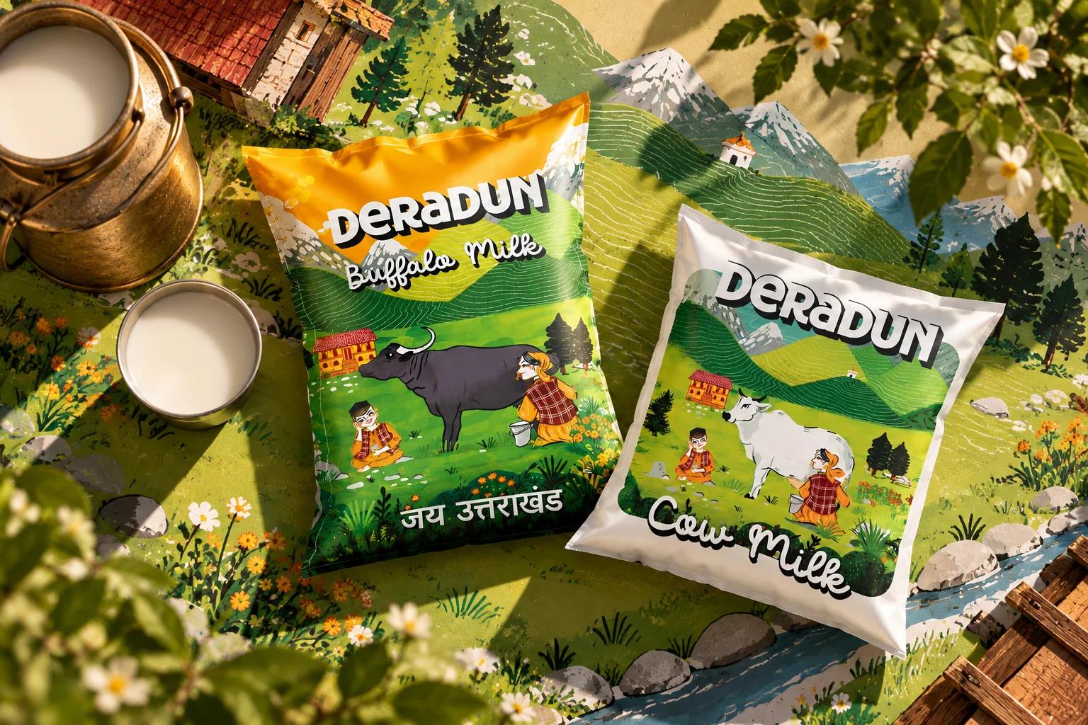
Now think about the visual culture this country already owns. Hand painted film hoardings. Truck art with its crowded colours and cheeky poetry. Kerala shop signs. Wedding card lettering. The mithai box with its gold and its swirls. None of it came from a feed. It came from people with brushes and opinions.
The digital version of sameness is the same story at higher speed.
02/ 06
Taste got a little lazy
Here is the uncomfortable thought. When a feed shows you what is popular you do not only see trends. You slowly adopt them as your own taste. After enough scrolling the thing that looks good is just the thing that looks like everything else you have been looking at.
That is a very comfortable place to design from. It feels like confidence. It feels like good taste. But it is mostly familiarity wearing a nice outfit.
And now we have tools that can generate that familiar look on demand. Ask for a brand identity in a “modern premium aesthetic” and you will receive something polished in seconds. It will be handsome and balanced and quietly forgettable. It is the average of every board that came before.
I do not think the tools are cheating. I think they are being honest. They are showing us what we collectively asked for.
03/ 06
Reference is not the same as research
There is a distinction I find useful.
Reference is looking at what other people made. Research is looking at the world the work will live in.
A designer who starts by browsing logos for a sweet shop will end up with a sweet shop logo that looks like other sweet shop logos. A designer who starts by spending an hour in the actual lane might notice that the halwai writes the prices on a steel board in a particular hand. Or that the street smells of fresh jalebis at six in the morning. Or that the old signboard next door uses a green nobody uses anymore.
Those details do not trend. That is exactly why they are valuable.
Reference tells you what is already visible. Research finds what has not yet been noticed.
04/ 06
Why originality got expensive
Originality has always been hard. What changed is the price of being average. It used to cost effort to look polished. Now polish is almost free which means polish no longer separates anyone.
So the things that remain scarce are the things that cannot be scraped. A real point of view. A particular place. An odd detail that came from paying attention. A decision that someone had to defend.
Those take time and they carry risk. Which is probably why fewer people attempt them.
05/ 06
A few experiments
I am not asking you to boycott inspiration. I am asking you to keep a bit of it unpredictable.
Cap your references. Give yourself five. Not fifty. Constraints force you to look harder at fewer things.
Look outside the category. Designing a cafe identity? Study old railway tickets or matchbox labels or truck art or hand painted shop shutters. Good ideas often come from the wrong shelf.
Go and see something in person. A lane in Old Delhi or a market in Jaipur or a temple town in the hills. The real world has not been algorithmically flattened. Yet.
Keep a private archive. Photograph or draw things you notice that no one told you to notice. Over time that collection becomes a voice that no feed could give you.
Put the board away before you start. Sketch your first idea from memory. Then open the references. You will be surprised how different the order feels.
06/ 06
The question under the question
Everything looks beautiful now. That is genuinely good news for beauty.
But being beautiful and being different are separate achievements. We have mastered the first. We are getting rusty at the second.
So the next time you feel the pull of a perfect reference ask a slightly rude question. If I removed the name from this work would anyone know it was mine?
And if the answer is no ask what you could add that only you would notice.
What was the last thing you noticed that nobody else seemed to see? Tell me in the replies.