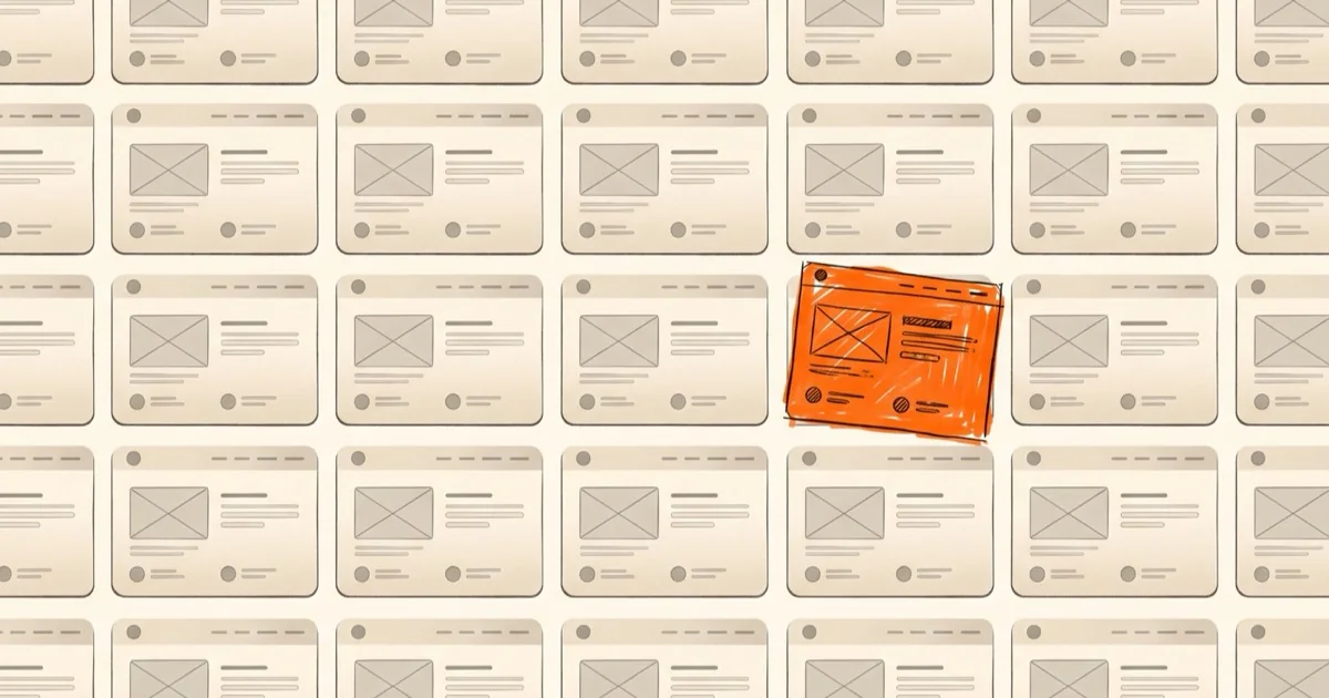
Try something with me. Open ten websites you visit often. Cover the logos. Now look at what is left.
Rounded cards. A soft gradient behind the headline. A friendly sans serif. A hero section with a big promise and two buttons. A row of testimonials with little round faces.
Chances are you will struggle to tell half of them apart.
That is strange when you think about it. These are different companies selling different things to different people. Yet they all seem to have been dressed by the same stylist.
01/ 05
How did we get here
Nothing sinister happened. It crept in slowly and for sensible reasons.
Design systems made consistency easy. Templates made speed easy. And now AI tools can put an entire landing page on your screen in under a minute. Every one of those things is genuinely useful. I use them too.
But each of them quietly asks the same question. What has worked before?
And the answer is always the average of everything that came before. Ask a machine for a “modern clean startup website” and you get the most agreeable version of that sentence. It is not wrong. It is just nobody in particular.
02/ 05
The beige problem
I think of it as beige. Not the colour. The feeling.
Beige is safe. Beige never gets complaints. Beige is also what you get when you remove every decision that carried risk.
A designer who picks an odd typeface is taking a risk. Someone who keeps an awkward illustration because it feels like the brand is taking a risk. Someone who says no to the third round of “can we make it pop” is taking a risk.
Remove enough risks and you remove the personality with them.
03/ 05
Why people are craving the opposite
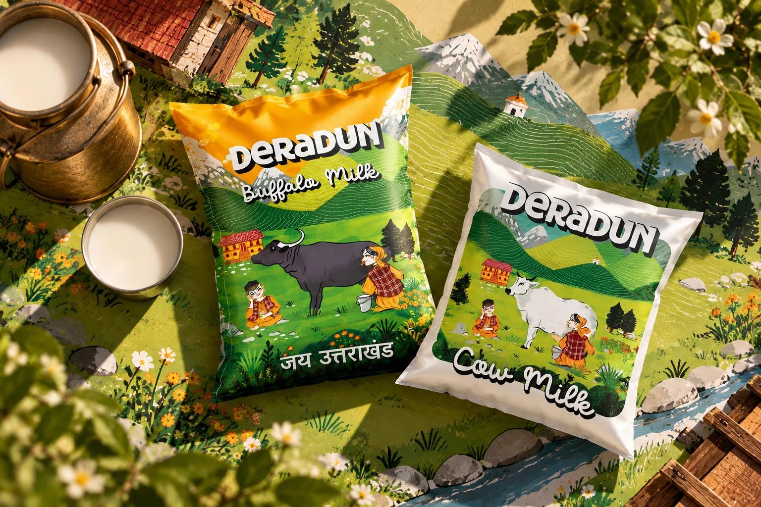
Look at what keeps getting attention lately. Hand drawn lettering. Rough textures. Paper grain. Slightly wonky layouts. Posters that look like a person actually made them with their hands. Designers keep calling it imperfection by design and I think the name fits.
It is not nostalgia for its own sake. It is a signal. When anyone can generate a polished surface in seconds polish stops meaning much. What carries value now is evidence of a person.
A small flaw says someone was here. Someone cared enough to leave it.
04/ 05
What I try to do about it
I am not saying throw the tools away. That would be silly and a little dishonest. Speed is a gift when you use it well.
Here is what I try to do instead.
Start with a point of view before you open a tool. Write one sentence about what this thing should feel like and one about what it should never feel like. A tool can execute taste. It cannot supply it.
Keep one thing that is not optimised. A hand drawn mark. An unusual word. A colour that makes someone slightly nervous. One deliberate odd choice is often enough to make a design memorable.
Run the logo cover test on your own work. If a stranger could not tell it apart from five competitors you are not finished yet.
Treat the first output as a draft and never as an answer. The first version from any tool is the average. Your job starts where the average ends.
05/ 05
The quiet advantage
There is something hopeful in all of this. As everything gets easier to make the rare skill becomes making something that feels specific. Distinct is the new premium.
So the next time a design looks perfect and feels like nothing take that feeling seriously. It is telling you something.
Perfect is easy now. Memorable is still hard.
And I suspect that is where the good work will happen from here.