Think about the last time you noticed a signboard while walking down a street. Some signs catch your attention almost instantly, while others barely register. Some brands feel premium even before you know what they offer. A hospital notice board can make information feel reassuring, while a warning sign can put you on alert before you’ve even read the complete message.
Have you ever wondered why?
It’s interesting how often we form opinions without really knowing what we’re responding to. We haven’t read the words, understood the message or even consciously processed what we’re looking at. Yet, something has already made an impression.
More often than we realise, that something is typography.
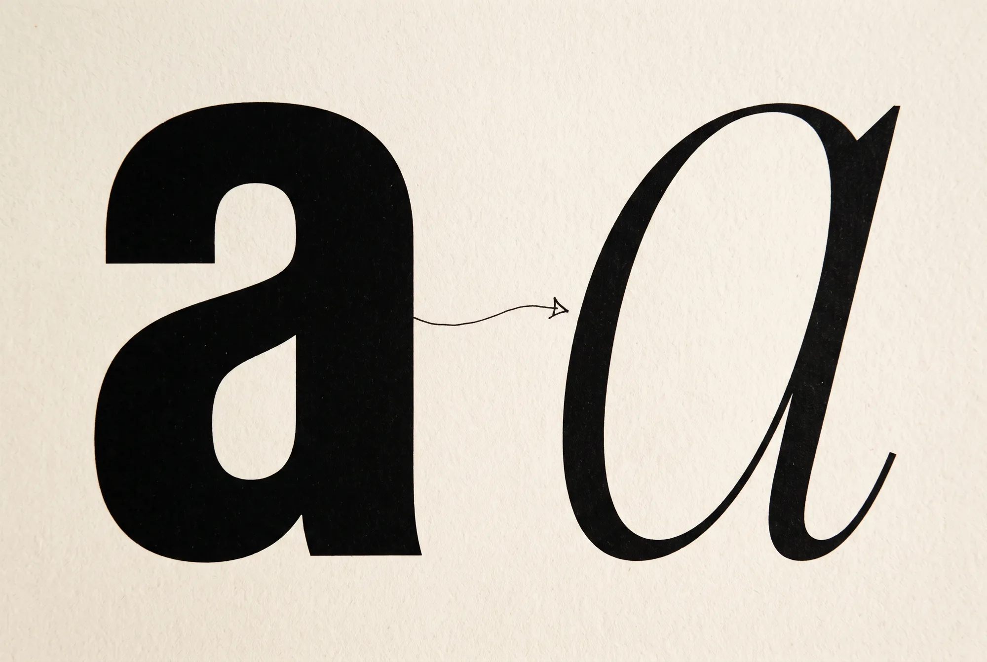
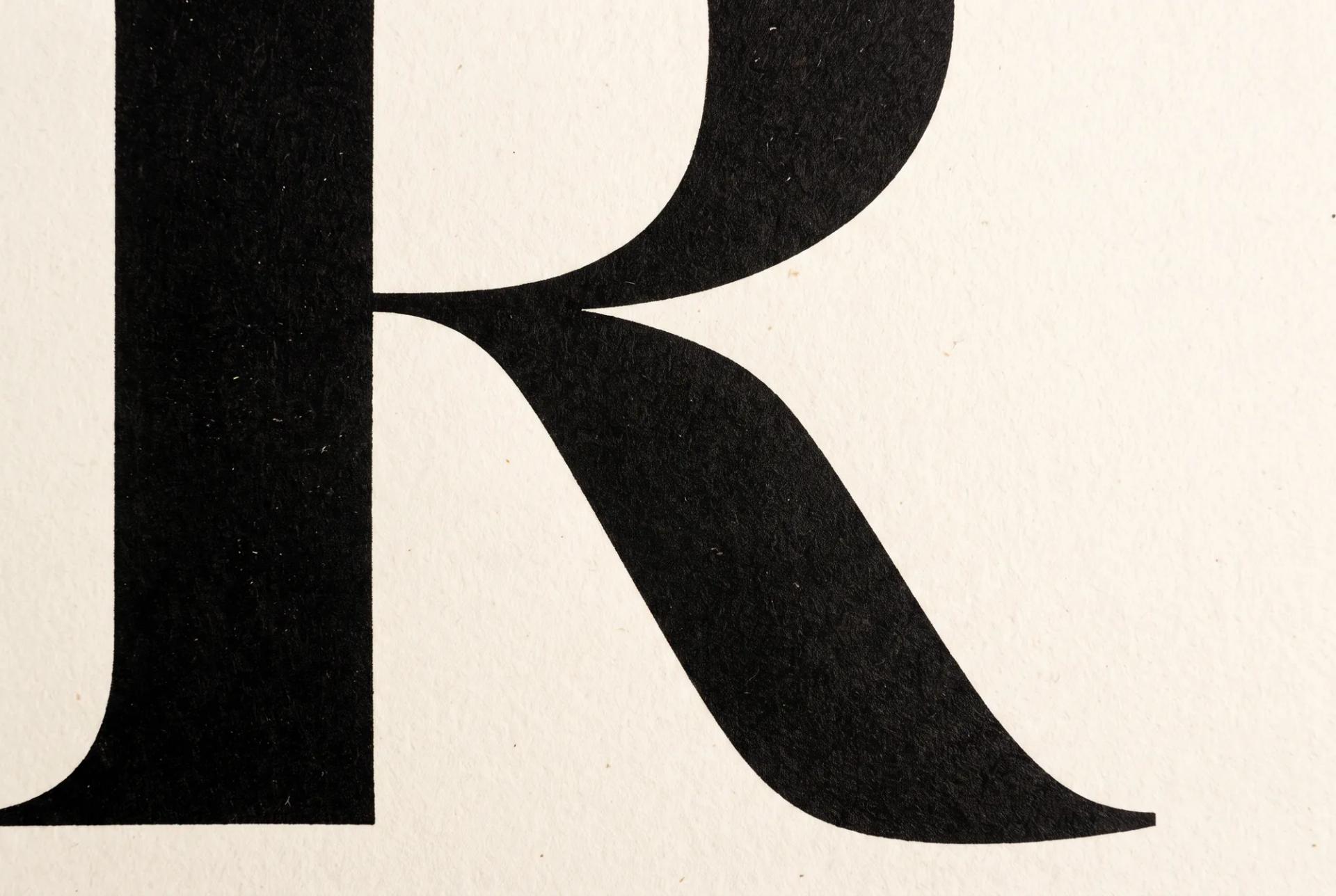
The shape of a letter, the weight of a typeface, the space between characters, the way words are arranged on a page. These might seem like small design decisions, but together, they influence how we see and interpret information. They can make something feel welcoming, authoritative, playful, serious or trustworthy.
And the fascinating part is that we experience this every single day, often without giving it a second thought.
Typography is so much more than choosing a font or making words look good. It is an essential part of how we communicate. It shapes our first impressions, guides our attention and, in many ways, influences how we experience the world around us.
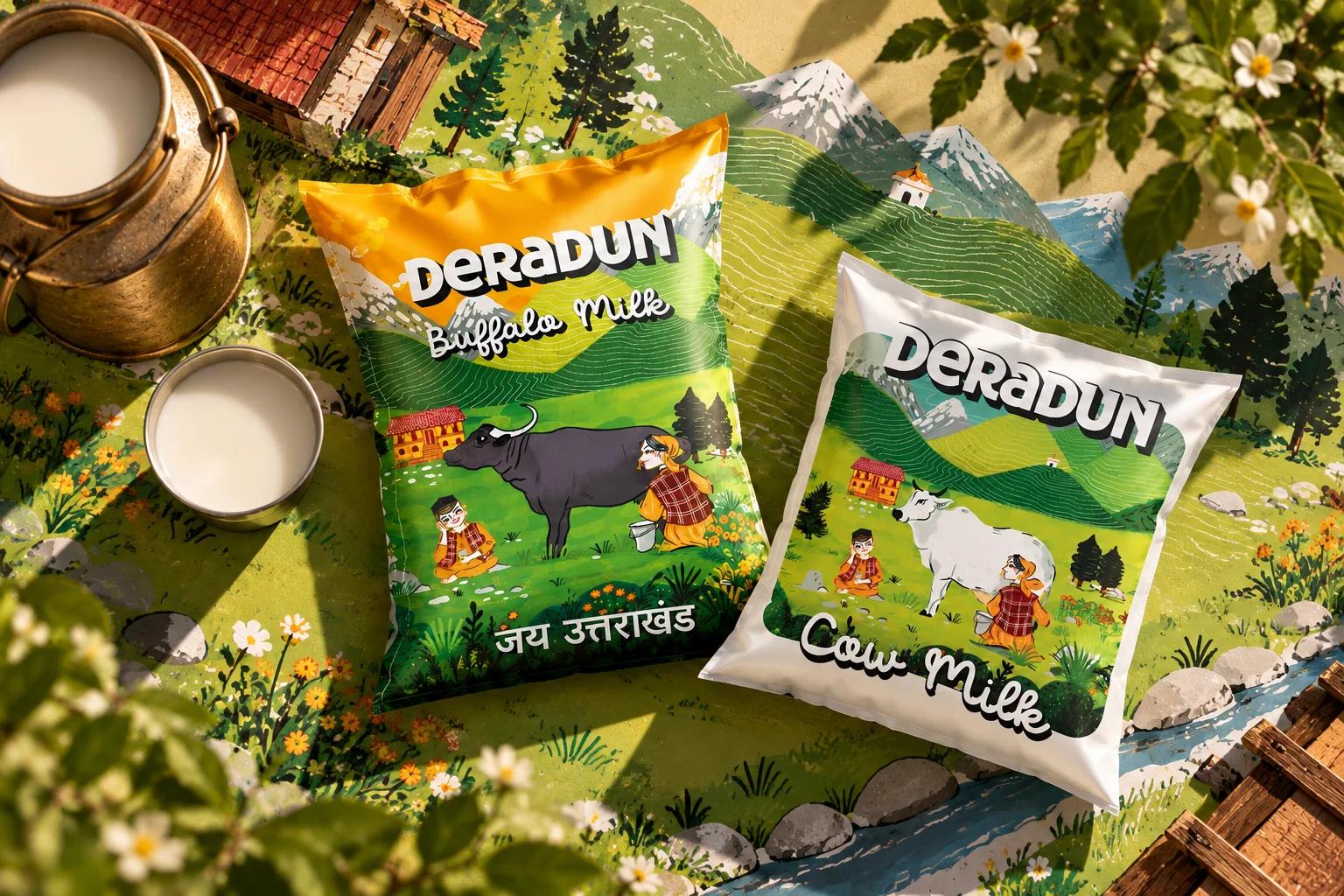
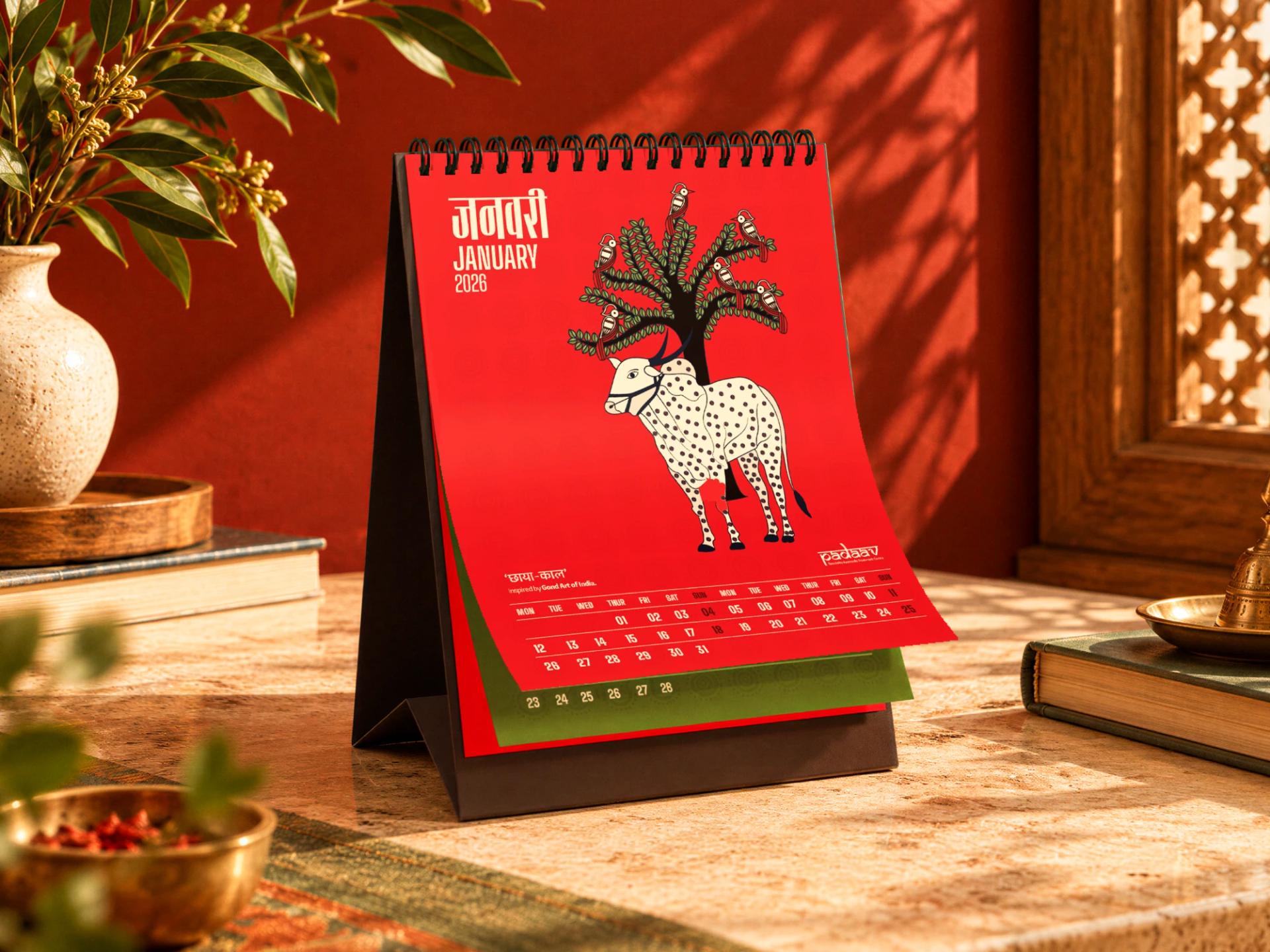
From a simple document sitting on your desk to a signboard on a busy street, from the packaging of a product to the identity of a global brand, typography is quietly doing its job.
We just don’t always notice it.
Perhaps that’s what makes it so interesting.
Good typography doesn’t always ask to be noticed. Sometimes, its greatest achievement is making sure everything else is.